UX Design Case Study

[:en]
UX design is an essential component in developing quality software. In this case study, we’ll explore how we transformed a clunky e-commerce platform into a streamlined shopping experience for customers.
Problem Statement
1.Slow User Adoption
The platform had a high learning curve, and users often became frustrated and abandoned the site.
2.Inconsistent User Feedback
There was no streamlined method for users to provide feedback, which caused inconsistent feedback that was hard to act on.
3.Low Conversion Rates
The clunky design led to a drop-off rate in the checkout process.
Research and Analysis
We conducted extensive research to understand the users’ needs and pain points, including surveys, user interviews, and analytics.
1.Quantitative Research
We analyzed data from surveys and analytic tools.
2.Qualitative Research
We conducted in-depth interviews with users to understand their needs and pain points.
3.Competitive Analysis:
We analyzed competitors and identified opportunities for improvement.
Design Process and Solutions :
1.Wireframing
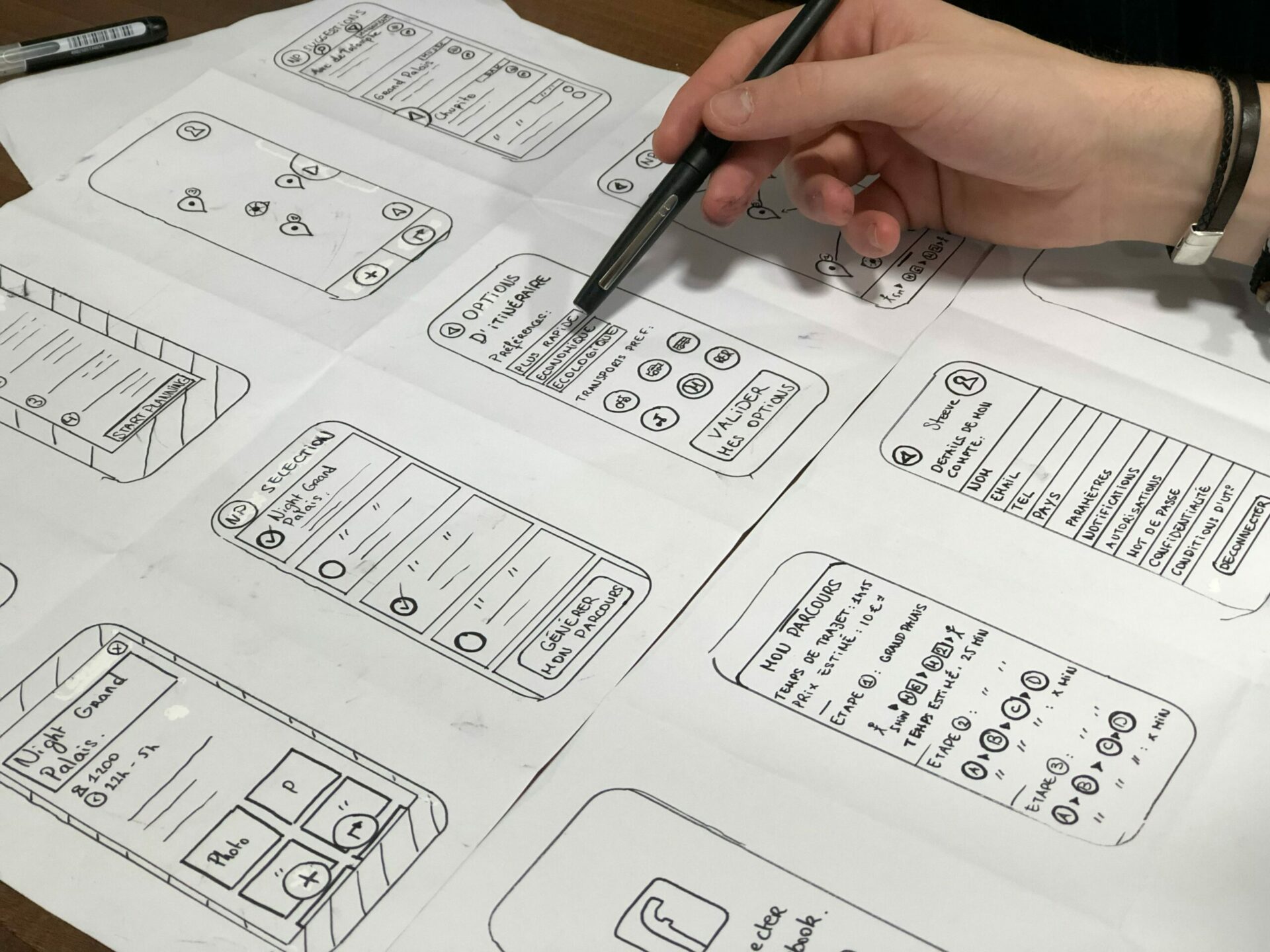
We designed wireframes and got user feedback to ensure an intuitive user experience.
- Streamlined interface
- Efficient checkout process
- Better search functionality
2.User Interface Design
We created a design system to ensure consistency and ease-of-use.
- Improved navigation
- Unified brand identity
- Responsive design for all devices
3.Testing and Refinement
We iterated on our design and tested it with users to refine and improve the user experience.
- Usability testing
- A/B testing
- Continuous feedback gathering
Prototype and Testing
After designing the wireframes and user interface, we tested the prototype with users to ensure an intuitive and enjoyable shopping experience.
- Shopping Cart :
We ensured the checkout process was quick and efficient by optimizing the shopping cart. - Product Search :
We improved the product search functionality to make it easier for users to find what they need. - Filtering Options :
We added new filtering options to make it easier for users to find the products they want. - Responsive Design :
We tested the design on different devices, ensuring the user experience was consistent regardless of screen size.
Results and Impact
Our design overhaul led to significant improvements in the user experience and the platform’s performance.
- 25% Increase in Conversion Rates:
The streamlined shopping experience led to a higher conversion rate for both new and returning customers. - Reduction in Cart Abandonment:
The improved checkout process led to fewer abandoned carts. - Higher User Satisfaction:
Users reported increased satisfaction with the new design and were more likely to recommend the platform.
Conclusion and Key Takeaways
Through extensive research, design, and testing, we transformed a clunky e-commerce platform into a seamless and intuitive shopping experience. The key takeaways are:
- User-Centric Design:
Design with the user in mind by getting feedback, testing often, and iterating as necessary. - Responsive Design:
Ensure a consistent user experience on all devices. - Conversion Optimization:
Streamline the buying process and make it easy for users to purchase products.
[:kh]
UX design is an essential component in developing quality software. In this case study, we’ll explore how we transformed a clunky e-commerce platform into a streamlined shopping experience for customers.
Problem Statement
1.Slow User Adoption
The platform had a high learning curve, and users often became frustrated and abandoned the site.
2.Inconsistent User Feedback
There was no streamlined method for users to provide feedback, which caused inconsistent feedback that was hard to act on.
3.Low Conversion Rates
The clunky design led to a drop-off rate in the checkout process.
Research and Analysis
We conducted extensive research to understand the users’ needs and pain points, including surveys, user interviews, and analytics.
1.Quantitative Research
We analyzed data from surveys and analytic tools.
2.Qualitative Research
We conducted in-depth interviews with users to understand their needs and pain points.
3.Competitive Analysis:
We analyzed competitors and identified opportunities for improvement.
Design Process and Solutions :
1.Wireframing
We designed wireframes and got user feedback to ensure an intuitive user experience.
- Streamlined interface
- Efficient checkout process
- Better search functionality
2.User Interface Design
We created a design system to ensure consistency and ease-of-use.
- Improved navigation
- Unified brand identity
- Responsive design for all devices
3.Testing and Refinement
We iterated on our design and tested it with users to refine and improve the user experience.
- Usability testing
- A/B testing
- Continuous feedback gathering
Prototype and Testing
After designing the wireframes and user interface, we tested the prototype with users to ensure an intuitive and enjoyable shopping experience.
- Shopping Cart :
We ensured the checkout process was quick and efficient by optimizing the shopping cart. - Product Search :
We improved the product search functionality to make it easier for users to find what they need. - Filtering Options :
We added new filtering options to make it easier for users to find the products they want. - Responsive Design :
We tested the design on different devices, ensuring the user experience was consistent regardless of screen size.
Results and Impact
Our design overhaul led to significant improvements in the user experience and the platform’s performance.
- 25% Increase in Conversion Rates:
The streamlined shopping experience led to a higher conversion rate for both new and returning customers. - Reduction in Cart Abandonment:
The improved checkout process led to fewer abandoned carts. - Higher User Satisfaction:
Users reported increased satisfaction with the new design and were more likely to recommend the platform.
Conclusion and Key Takeaways
Through extensive research, design, and testing, we transformed a clunky e-commerce platform into a seamless and intuitive shopping experience. The key takeaways are:
- User-Centric Design:
Design with the user in mind by getting feedback, testing often, and iterating as necessary. - Responsive Design:
Ensure a consistent user experience on all devices. - Conversion Optimization:
Streamline the buying process and make it easy for users to purchase products.
[:]
Share this Article !


